


Phát sóng
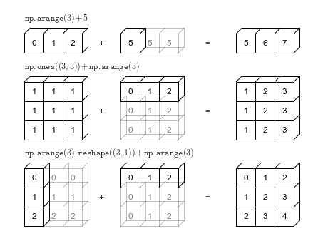
# Adapted from astroML: see http://www.astroml.org/book_figures/appendix/fig_broadcast_visual.htmlimport numpy as npfrom matplotlib import pyplot as plt#------------------------------------------------------------# Draw a figure and axis with no boundaryfig = plt.figure(figsize=(6, 4.5), facecolor='w')ax = plt.axes([0, 0, 1, 1], xticks=[], yticks=[], frameon=False)def draw_cube(ax, xy, size, depth=0.4, edges=None, label=None, label_kwargs=None, **kwargs): """draw and label a cube. edges is a list of numbers between 1 and 12, specifying which of the 12 cube edges to draw""" if edges is None: edges = range(1, 13) x, y = xy if 1 in edges: ax.plot([x, x + size], [y + size, y + size], **kwargs) if 2 in edges: ax.plot([x + size, x + size], [y, y + size], **kwargs) if 3 in edges: ax.plot([x, x + size], [y, y], **kwargs) if 4 in edges: ax.plot([x, x], [y, y + size], **kwargs) if 5 in edges: ax.plot([x, x + depth], [y + size, y + depth + size], **kwargs) if 6 in edges: ax.plot([x + size, x + size + depth], [y + size, y + depth + size], **kwargs) if 7 in edges: ax.plot([x + size, x + size + depth], [y, y + depth], **kwargs) if 8 in edges: ax.plot([x, x + depth], [y, y + depth], **kwargs) if 9 in edges: ax.plot([x + depth, x + depth + size], [y + depth + size, y + depth + size], **kwargs) if 10 in edges: ax.plot([x + depth + size, x + depth + size], [y + depth, y + depth + size], **kwargs) if 11 in edges: ax.plot([x + depth, x + depth + size], [y + depth, y + depth], **kwargs) if 12 in edges: ax.plot([x + depth, x + depth], [y + depth, y + depth + size], **kwargs) if label: if label_kwargs is None: label_kwargs = {} ax.text(x + 0.5 * size, y + 0.5 * size, label, ha='center', va='center', **label_kwargs)solid = dict(c='black', ls='-', lw=1, label_kwargs=dict(color='k'))dotted = dict(c='black', ls='-', lw=0.5, alpha=0.5, label_kwargs=dict(color='gray'))depth = 0.3#------------------------------------------------------------# Draw top operation: vector plus scalardraw_cube(ax, (1, 10), 1, depth, [1, 2, 3, 4, 5, 6, 9], '0', **solid)draw_cube(ax, (2, 10), 1, depth, [1, 2, 3, 6, 9], '1', **solid)draw_cube(ax, (3, 10), 1, depth, [1, 2, 3, 6, 7, 9, 10], '2', **solid)draw_cube(ax, (6, 10), 1, depth, [1, 2, 3, 4, 5, 6, 7, 9, 10], '5', **solid)draw_cube(ax, (7, 10), 1, depth, [1, 2, 3, 6, 7, 9, 10, 11], '5', **dotted)draw_cube(ax, (8, 10), 1, depth, [1, 2, 3, 6, 7, 9, 10, 11], '5', **dotted)draw_cube(ax, (12, 10), 1, depth, [1, 2, 3, 4, 5, 6, 9], '5', **solid)draw_cube(ax, (13, 10), 1, depth, [1, 2, 3, 6, 9], '6', **solid)draw_cube(ax, (14, 10), 1, depth, [1, 2, 3, 6, 7, 9, 10], '7', **solid)ax.text(5, 10.5, '+', size=12, ha='center', va='center')ax.text(10.5, 10.5, '=', size=12, ha='center', va='center')ax.text(1, 11.5, r'${\tt np.arange(3) + 5}$', size=12, ha='left', va='bottom')#------------------------------------------------------------# Draw middle operation: matrix plus vector# first blockdraw_cube(ax, (1, 7.5), 1, depth, [1, 2, 3, 4, 5, 6, 9], '1', **solid)draw_cube(ax, (2, 7.5), 1, depth, [1, 2, 3, 6, 9], '1', **solid)draw_cube(ax, (3, 7.5), 1, depth, [1, 2, 3, 6, 7, 9, 10], '1', **solid)draw_cube(ax, (1, 6.5), 1, depth, [2, 3, 4], '1', **solid)draw_cube(ax, (2, 6.5), 1, depth, [2, 3], '1', **solid)draw_cube(ax, (3, 6.5), 1, depth, [2, 3, 7, 10], '1', **solid)draw_cube(ax, (1, 5.5), 1, depth, [2, 3, 4], '1', **solid)draw_cube(ax, (2, 5.5), 1, depth, [2, 3], '1', **solid)draw_cube(ax, (3, 5.5), 1, depth, [2, 3, 7, 10], '1', **solid)# second blockdraw_cube(ax, (6, 7.5), 1, depth, [1, 2, 3, 4, 5, 6, 9], '0', **solid)draw_cube(ax, (7, 7.5), 1, depth, [1, 2, 3, 6, 9], '1', **solid)draw_cube(ax, (8, 7.5), 1, depth, [1, 2, 3, 6, 7, 9, 10], '2', **solid)draw_cube(ax, (6, 6.5), 1, depth, range(2, 13), '0', **dotted)draw_cube(ax, (7, 6.5), 1, depth, [2, 3, 6, 7, 9, 10, 11], '1', **dotted)draw_cube(ax, (8, 6.5), 1, depth, [2, 3, 6, 7, 9, 10, 11], '2', **dotted)draw_cube(ax, (6, 5.5), 1, depth, [2, 3, 4, 7, 8, 10, 11, 12], '0', **dotted)draw_cube(ax, (7, 5.5), 1, depth, [2, 3, 7, 10, 11], '1', **dotted)draw_cube(ax, (8, 5.5), 1, depth, [2, 3, 7, 10, 11], '2', **dotted)# third blockdraw_cube(ax, (12, 7.5), 1, depth, [1, 2, 3, 4, 5, 6, 9], '1', **solid)draw_cube(ax, (13, 7.5), 1, depth, [1, 2, 3, 6, 9], '2', **solid)draw_cube(ax, (14, 7.5), 1, depth, [1, 2, 3, 6, 7, 9, 10], '3', **solid)draw_cube(ax, (12, 6.5), 1, depth, [2, 3, 4], '1', **solid)draw_cube(ax, (13, 6.5), 1, depth, [2, 3], '2', **solid)draw_cube(ax, (14, 6.5), 1, depth, [2, 3, 7, 10], '3', **solid)draw_cube(ax, (12, 5.5), 1, depth, [2, 3, 4], '1', **solid)draw_cube(ax, (13, 5.5), 1, depth, [2, 3], '2', **solid)draw_cube(ax, (14, 5.5), 1, depth, [2, 3, 7, 10], '3', **solid)ax.text(5, 7.0, '+', size=12, ha='center', va='center')ax.text(10.5, 7.0, '=', size=12, ha='center', va='center')ax.text(1, 9.0, r'${\tt np.ones((3,\, 3)) + np.arange(3)}$', size=12, ha='left', va='bottom')#------------------------------------------------------------# Draw bottom operation: vector plus vector, double broadcast# first blockdraw_cube(ax, (1, 3), 1, depth, [1, 2, 3, 4, 5, 6, 7, 9, 10], '0', **solid)draw_cube(ax, (1, 2), 1, depth, [2, 3, 4, 7, 10], '1', **solid)draw_cube(ax, (1, 1), 1, depth, [2, 3, 4, 7, 10], '2', **solid)draw_cube(ax, (2, 3), 1, depth, [1, 2, 3, 6, 7, 9, 10, 11], '0', **dotted)draw_cube(ax, (2, 2), 1, depth, [2, 3, 7, 10, 11], '1', **dotted)draw_cube(ax, (2, 1), 1, depth, [2, 3, 7, 10, 11], '2', **dotted)draw_cube(ax, (3, 3), 1, depth, [1, 2, 3, 6, 7, 9, 10, 11], '0', **dotted)draw_cube(ax, (3, 2), 1, depth, [2, 3, 7, 10, 11], '1', **dotted)draw_cube(ax, (3, 1), 1, depth, [2, 3, 7, 10, 11], '2', **dotted)# second blockdraw_cube(ax, (6, 3), 1, depth, [1, 2, 3, 4, 5, 6, 9], '0', **solid)draw_cube(ax, (7, 3), 1, depth, [1, 2, 3, 6, 9], '1', **solid)draw_cube(ax, (8, 3), 1, depth, [1, 2, 3, 6, 7, 9, 10], '2', **solid)draw_cube(ax, (6, 2), 1, depth, range(2, 13), '0', **dotted)draw_cube(ax, (7, 2), 1, depth, [2, 3, 6, 7, 9, 10, 11], '1', **dotted)draw_cube(ax, (8, 2), 1, depth, [2, 3, 6, 7, 9, 10, 11], '2', **dotted)draw_cube(ax, (6, 1), 1, depth, [2, 3, 4, 7, 8, 10, 11, 12], '0', **dotted)draw_cube(ax, (7, 1), 1, depth, [2, 3, 7, 10, 11], '1', **dotted)draw_cube(ax, (8, 1), 1, depth, [2, 3, 7, 10, 11], '2', **dotted)# third blockdraw_cube(ax, (12, 3), 1, depth, [1, 2, 3, 4, 5, 6, 9], '0', **solid)draw_cube(ax, (13, 3), 1, depth, [1, 2, 3, 6, 9], '1', **solid)draw_cube(ax, (14, 3), 1, depth, [1, 2, 3, 6, 7, 9, 10], '2', **solid)draw_cube(ax, (12, 2), 1, depth, [2, 3, 4], '1', **solid)draw_cube(ax, (13, 2), 1, depth, [2, 3], '2', **solid)draw_cube(ax, (14, 2), 1, depth, [2, 3, 7, 10], '3', **solid)draw_cube(ax, (12, 1), 1, depth, [2, 3, 4], '2', **solid)draw_cube(ax, (13, 1), 1, depth, [2, 3], '3', **solid)draw_cube(ax, (14, 1), 1, depth, [2, 3, 7, 10], '4', **solid)ax.text(5, 2.5, '+', size=12, ha='center', va='center')ax.text(10.5, 2.5, '=', size=12, ha='center', va='center')ax.text(1, 4.5, r'${\tt np.arange(3).reshape((3,\, 1)) + np.arange(3)}$', ha='left', size=12, va='bottom')ax.set_xlim(0, 16)ax.set_ylim(0.5, 12.5)fig.savefig('figures/02.05-broadcasting.png')
Aggregation và Nhóm
Các số liệu từ chương trình về tổ hợp và nhóm hóa
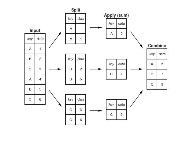
Phân tách-Áp dụng-Kết hợp
def draw_dataframe(df, loc=None, width=None, ax=None, linestyle=None, textstyle=None): loc = loc or [0, 0] width = width or 1 x, y = loc if ax is None: ax = plt.gca() ncols = len(df.columns) + 1 nrows = len(df.index) + 1 dx = dy = width / ncols if linestyle is None: linestyle = {'color':'black'} if textstyle is None: textstyle = {'size': 12} textstyle.update({'ha':'center', 'va':'center'}) # draw vertical lines for i in range(ncols + 1): plt.plot(2 * [x + i * dx], [y, y + dy * nrows], **linestyle) # draw horizontal lines for i in range(nrows + 1): plt.plot([x, x + dx * ncols], 2 * [y + i * dy], **linestyle) # Create index labels for i in range(nrows - 1): plt.text(x + 0.5 * dx, y + (i + 0.5) * dy, str(df.index[::-1][i]), **textstyle) # Create column labels for i in range(ncols - 1): plt.text(x + (i + 1.5) * dx, y + (nrows - 0.5) * dy, str(df.columns[i]), style='italic', **textstyle) # Add index label if df.index.name: plt.text(x + 0.5 * dx, y + (nrows - 0.5) * dy, str(df.index.name), style='italic', **textstyle) # Insert data for i in range(nrows - 1): for j in range(ncols - 1): plt.text(x + (j + 1.5) * dx, y + (i + 0.5) * dy, str(df.values[::-1][i, j]), **textstyle)#----------------------------------------------------------# Draw figureimport pandas as pddf = pd.DataFrame({'data': [1, 2, 3, 4, 5, 6]}, index=['A', 'B', 'C', 'A', 'B', 'C'])df.index.name = 'key'fig = plt.figure(figsize=(8, 6), facecolor='white')ax = plt.axes([0, 0, 1, 1])ax.axis('off')draw_dataframe(df, [0, 0])for y, ind in zip([3, 1, -1], 'ABC'): split = df[df.index == ind] draw_dataframe(split, [2, y]) sum = pd.DataFrame(split.sum()).T sum.index = [ind] sum.index.name = 'key' sum.columns = ['data'] draw_dataframe(sum, [4, y + 0.25]) result = df.groupby(df.index).sum()draw_dataframe(result, [6, 0.75])style = dict(fontsize=14, ha='center', weight='bold')plt.text(0.5, 3.6, "Input", **style)plt.text(2.5, 4.6, "Split", **style)plt.text(4.5, 4.35, "Apply (sum)", **style)plt.text(6.5, 2.85, "Combine", **style)arrowprops = dict(facecolor='black', width=1, headwidth=6)plt.annotate('', (1.8, 3.6), (1.2, 2.8), arrowprops=arrowprops)plt.annotate('', (1.8, 1.75), (1.2, 1.75), arrowprops=arrowprops)plt.annotate('', (1.8, -0.1), (1.2, 0.7), arrowprops=arrowprops)plt.annotate('', (3.8, 3.8), (3.2, 3.8), arrowprops=arrowprops)plt.annotate('', (3.8, 1.75), (3.2, 1.75), arrowprops=arrowprops)plt.annotate('', (3.8, -0.3), (3.2, -0.3), arrowprops=arrowprops)plt.annotate('', (5.8, 2.8), (5.2, 3.6), arrowprops=arrowprops)plt.annotate('', (5.8, 1.75), (5.2, 1.75), arrowprops=arrowprops)plt.annotate('', (5.8, 0.7), (5.2, -0.1), arrowprops=arrowprops) plt.axis('equal')plt.ylim(-1.5, 5);fig.savefig('figures/03.08-split-apply-combine.png')
Máy học là gì?
# common plot formatting for belowdef format_plot(ax, title): ax.xaxis.set_major_formatter(plt.NullFormatter()) ax.yaxis.set_major_formatter(plt.NullFormatter()) ax.set_xlabel('feature 1', color='gray') ax.set_ylabel('feature 2', color='gray') ax.set_title(title, color='gray')
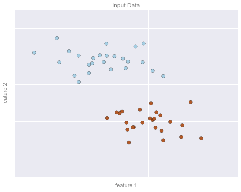
Hình minh họa ví dụ Phân loại
Đoạn mã sau tạo ra các hình ảnh từ phần phân loại.
from sklearn.datasets.samples_generator import make_blobsfrom sklearn.svm import SVC# create 50 separable pointsX, y = make_blobs(n_samples=50, centers=2, random_state=0, cluster_std=0.60)# fit the support vector classifier modelclf = SVC(kernel='linear')clf.fit(X, y)# create some new points to predictX2, _ = make_blobs(n_samples=80, centers=2, random_state=0, cluster_std=0.80)X2 = X2[50:]# predict the labelsy2 = clf.predict(X2)
Ví dụ phân loại Hình 1
# plot the datafig, ax = plt.subplots(figsize=(8, 6))point_style = dict(cmap='Paired', s=50)ax.scatter(X[:, 0], X[:, 1], c=y, **point_style)# format plotformat_plot(ax, 'Input Data')ax.axis([-1, 4, -2, 7])fig.savefig('figures/05.01-classification-1.png')
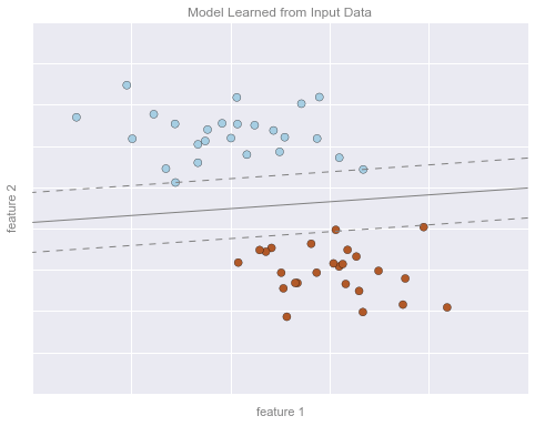
Hình minh họa phân loại 2
# Get contours describing the modelxx = np.linspace(-1, 4, 10)yy = np.linspace(-2, 7, 10)xy1, xy2 = np.meshgrid(xx, yy)Z = np.array([clf.decision_function([t]) for t in zip(xy1.flat, xy2.flat)]).reshape(xy1.shape)# plot points and modelfig, ax = plt.subplots(figsize=(8, 6))line_style = dict(levels = [-1.0, 0.0, 1.0], linestyles = ['dashed', 'solid', 'dashed'], colors = 'gray', linewidths=1)ax.scatter(X[:, 0], X[:, 1], c=y, **point_style)ax.contour(xy1, xy2, Z, **line_style)# format plotformat_plot(ax, 'Model Learned from Input Data')ax.axis([-1, 4, -2, 7])fig.savefig('figures/05.01-classification-2.png')
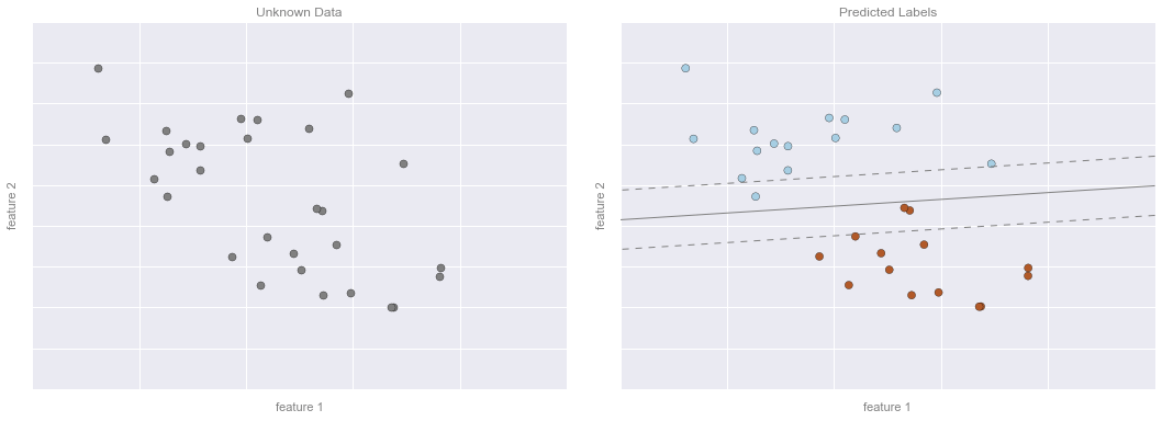
Bài ví dụ về phân loại – Hình 3
# plot the resultsfig, ax = plt.subplots(1, 2, figsize=(16, 6))fig.subplots_adjust(left=0.0625, right=0.95, wspace=0.1)ax[0].scatter(X2[:, 0], X2[:, 1], c='gray', **point_style)ax[0].axis([-1, 4, -2, 7])ax[1].scatter(X2[:, 0], X2[:, 1], c=y2, **point_style)ax[1].contour(xy1, xy2, Z, **line_style)ax[1].axis([-1, 4, -2, 7])format_plot(ax[0], 'Unknown Data')format_plot(ax[1], 'Predicted Labels')fig.savefig('figures/05.01-classification-3.png')
Các Hình Ví dụ Hồi quy
Các đoạn mã sau sẽ tạo ra các hình ảnh từ phần hồi quy.
from sklearn.linear_model import LinearRegression# Create some data for the regressionrng = np.random.RandomState(1)X = rng.randn(200, 2)y = np.dot(X, [-2, 1]) + 0.1 * rng.randn(X.shape[0])# fit the regression modelmodel = LinearRegression()model.fit(X, y)# create some new points to predictX2 = rng.randn(100, 2)# predict the labelsy2 = model.predict(X2)
Hình minh họa Ví dụ Hồi quy 1
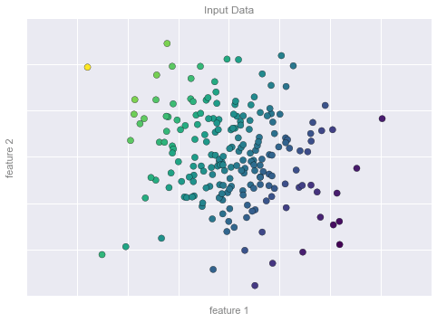
# plot data pointsfig, ax = plt.subplots()points = ax.scatter(X[:, 0], X[:, 1], c=y, s=50, cmap='viridis')# format plotformat_plot(ax, 'Input Data')ax.axis([-4, 4, -3, 3])fig.savefig('figures/05.01-regression-1.png')
Hình minh họa Ví dụ Hồi quy 2
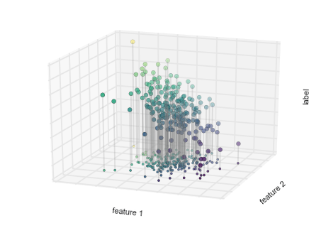
from mpl_toolkits.mplot3d.art3d import Line3DCollectionpoints = np.hstack([X, y[:, None]]).reshape(-1, 1, 3)segments = np.hstack([points, points])segments[:, 0, 2] = -8# plot points in 3Dfig = plt.figure()ax = fig.add_subplot(111, projection='3d')ax.scatter(X[:, 0], X[:, 1], y, c=y, s=35, cmap='viridis')ax.add_collection3d(Line3DCollection(segments, colors='gray', alpha=0.2))ax.scatter(X[:, 0], X[:, 1], -8 + np.zeros(X.shape[0]), c=y, s=10, cmap='viridis')# format plotax.patch.set_facecolor('white')ax.view_init(elev=20, azim=-70)ax.set_zlim3d(-8, 8)ax.xaxis.set_major_formatter(plt.NullFormatter())ax.yaxis.set_major_formatter(plt.NullFormatter())ax.zaxis.set_major_formatter(plt.NullFormatter())ax.set(xlabel='feature 1', ylabel='feature 2', zlabel='label')# Hide axes (is there a better way?)ax.w_xaxis.line.set_visible(False)ax.w_yaxis.line.set_visible(False)ax.w_zaxis.line.set_visible(False)for tick in ax.w_xaxis.get_ticklines(): tick.set_visible(False)for tick in ax.w_yaxis.get_ticklines(): tick.set_visible(False)for tick in ax.w_zaxis.get_ticklines(): tick.set_visible(False)fig.savefig('figures/05.01-regression-2.png')
Ví dụ Huấn luyện Hồi quy Hình 3
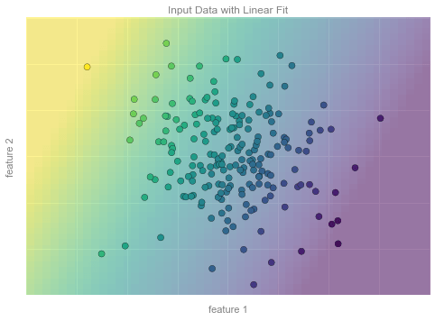
from matplotlib.collections import LineCollection# plot data pointsfig, ax = plt.subplots()pts = ax.scatter(X[:, 0], X[:, 1], c=y, s=50, cmap='viridis', zorder=2)# compute and plot model color meshxx, yy = np.meshgrid(np.linspace(-4, 4), np.linspace(-3, 3))Xfit = np.vstack([xx.ravel(), yy.ravel()]).Tyfit = model.predict(Xfit)zz = yfit.reshape(xx.shape)ax.pcolorfast([-4, 4], [-3, 3], zz, alpha=0.5, cmap='viridis', norm=pts.norm, zorder=1)# format plotformat_plot(ax, 'Input Data with Linear Fit')ax.axis([-4, 4, -3, 3])fig.savefig('figures/05.01-regression-3.png')
Hình minh họa ví dụ về Hồi quy – Hình 4
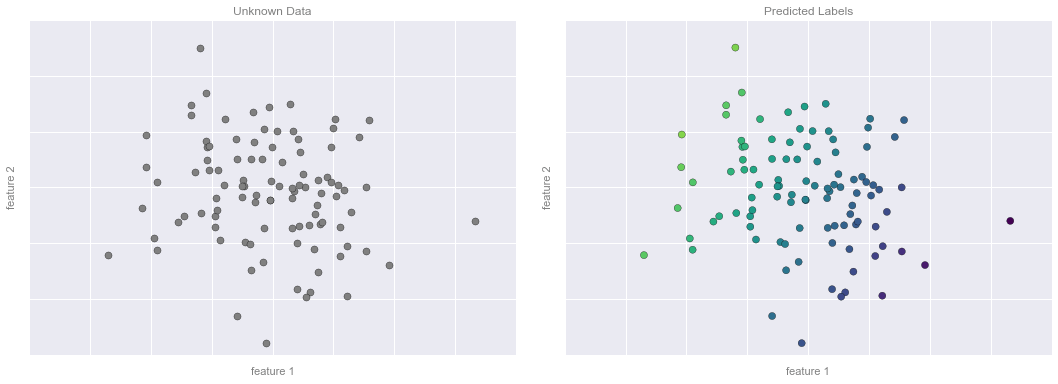
# plot the model fitfig, ax = plt.subplots(1, 2, figsize=(16, 6))fig.subplots_adjust(left=0.0625, right=0.95, wspace=0.1)ax[0].scatter(X2[:, 0], X2[:, 1], c='gray', s=50)ax[0].axis([-4, 4, -3, 3])ax[1].scatter(X2[:, 0], X2[:, 1], c=y2, s=50, cmap='viridis', norm=pts.norm)ax[1].axis([-4, 4, -3, 3])# format plotsformat_plot(ax[0], 'Unknown Data')format_plot(ax[1], 'Predicted Labels')fig.savefig('figures/05.01-regression-4.png')
Hình minh họa về Clustering
Mã sau đây tạo ra các hình ảnh từ phần gom cụm.
from sklearn.datasets.samples_generator import make_blobsfrom sklearn.cluster import KMeans# create 50 separable pointsX, y = make_blobs(n_samples=100, centers=4, random_state=42, cluster_std=1.5)# Fit the K Means modelmodel = KMeans(4, random_state=0)y = model.fit_predict(X)
Ví dụ về phân nhóm Hình 1
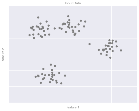
# plot the input datafig, ax = plt.subplots(figsize=(8, 6))ax.scatter(X[:, 0], X[:, 1], s=50, color='gray')# format the plotformat_plot(ax, 'Input Data')fig.savefig('figures/05.01-clustering-1.png')
Ví dụ về phân nhóm Hình 2
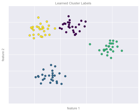
# plot the data with cluster labelsfig, ax = plt.subplots(figsize=(8, 6))ax.scatter(X[:, 0], X[:, 1], s=50, c=y, cmap='viridis')# format the plotformat_plot(ax, 'Learned Cluster Labels')fig.savefig('figures/05.01-clustering-2.png')
Hình minh họa Ví dụ Giảm Chiều Dữ liệu
Mã HTML dưới đây tạo ra các hình ảnh từ phần giảm chiều dữ liệu.
Hình ví dụ giảm chiều dữ liệu, Hình 1
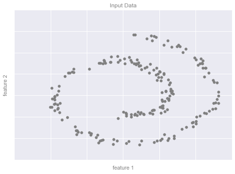
from sklearn.datasets import make_swiss_roll# make dataX, y = make_swiss_roll(200, noise=0.5, random_state=42)X = X[:, [0, 2]]# visualize datafig, ax = plt.subplots()ax.scatter(X[:, 0], X[:, 1], color='gray', s=30)# format the plotformat_plot(ax, 'Input Data')fig.savefig('figures/05.01-dimesionality-1.png')
Ví dụ Giảm chiều dữ liệu Hình 2
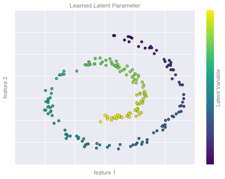
from sklearn.manifold import Isomapmodel = Isomap(n_neighbors=8, n_components=1)y_fit = model.fit_transform(X).ravel()# visualize datafig, ax = plt.subplots()pts = ax.scatter(X[:, 0], X[:, 1], c=y_fit, cmap='viridis', s=30)cb = fig.colorbar(pts, ax=ax)# format the plotformat_plot(ax, 'Learned Latent Parameter')cb.set_ticks([])cb.set_label('Latent Variable', color='gray')fig.savefig('figures/05.01-dimesionality-2.png')
Giới thiệu Scikit-Learn
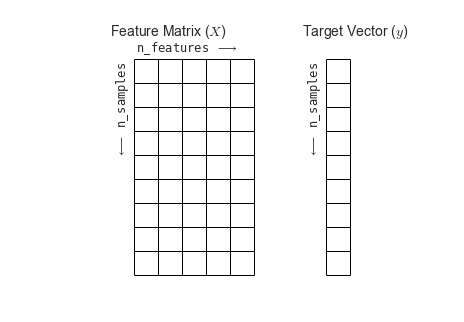
Features and Labels Grid
Phần dưới đây là đoạn mã tạo ra biểu đồ hiển thị ma trận tính năng và mảng mục tiêu.
fig = plt.figure(figsize=(6, 4))ax = fig.add_axes([0, 0, 1, 1])ax.axis('off')ax.axis('equal')# Draw features matrixax.vlines(range(6), ymin=0, ymax=9, lw=1)ax.hlines(range(10), xmin=0, xmax=5, lw=1)font_prop = dict(size=12, family='monospace')ax.text(-1, -1, "Feature Matrix ($X$)", size=14)ax.text(0.1, -0.3, r'n_features $\longrightarrow$', **font_prop)ax.text(-0.1, 0.1, r'$\longleftarrow$ n_samples', rotation=90, va='top', ha='right', **font_prop)# Draw labels vectorax.vlines(range(8, 10), ymin=0, ymax=9, lw=1)ax.hlines(range(10), xmin=8, xmax=9, lw=1)ax.text(7, -1, "Target Vector ($y$)", size=14)ax.text(7.9, 0.1, r'$\longleftarrow$ n_samples', rotation=90, va='top', ha='right', **font_prop)ax.set_ylim(10, -2)fig.savefig('figures/05.02-samples-features.png')
Hyperparameters và Xác nhận Mô hình
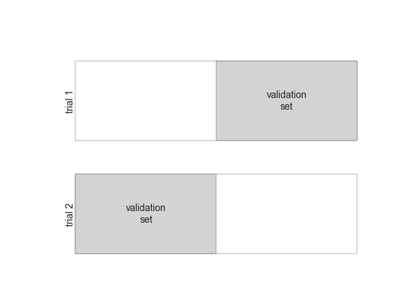
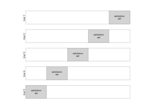
Hình minh họa Cross-Validation
def draw_rects(N, ax, textprop={}): for i in range(N): ax.add_patch(plt.Rectangle((0, i), 5, 0.7, fc='white')) ax.add_patch(plt.Rectangle((5. * i / N, i), 5. / N, 0.7, fc='lightgray')) ax.text(5. * (i + 0.5) / N, i + 0.35, "validation\nset", ha='center', va='center', **textprop) ax.text(0, i + 0.35, "trial {0}".format(N - i), ha='right', va='center', rotation=90, **textprop) ax.set_xlim(-1, 6) ax.set_ylim(-0.2, N + 0.2)
2-Fold Cross-Validation
fig = plt.figure()ax = fig.add_axes([0, 0, 1, 1])ax.axis('off')draw_rects(2, ax, textprop=dict(size=14))fig.savefig('figures/05.03-2-fold-CV.png')
5-Fold Cross-Validation
fig = plt.figure()ax = fig.add_axes([0, 0, 1, 1])ax.axis('off')draw_rects(5, ax, textprop=dict(size=10))fig.savefig('figures/05.03-5-fold-CV.png')
Overfitting và Underfitting
import numpy as npdef make_data(N=30, err=0.8, rseed=1): # randomly sample the data rng = np.random.RandomState(rseed) X = rng.rand(N, 1) ** 2 y = 10 - 1. / (X.ravel() + 0.1) if err > 0: y += err * rng.randn(N) return X, y
from sklearn.preprocessing import PolynomialFeaturesfrom sklearn.linear_model import LinearRegressionfrom sklearn.pipeline import make_pipelinedef PolynomialRegression(degree=2, **kwargs): return make_pipeline(PolynomialFeatures(degree), LinearRegression(**kwargs))
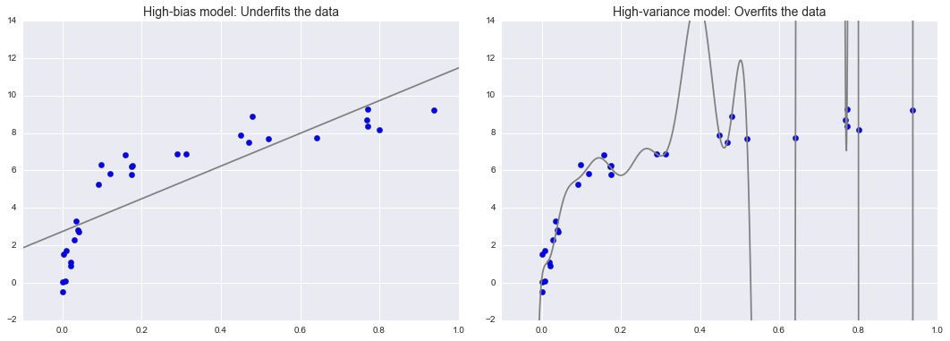
Tổng trội của Độ lệch – Dải biến
X, y = make_data()xfit = np.linspace(-0.1, 1.0, 1000)[:, None]model1 = PolynomialRegression(1).fit(X, y)model20 = PolynomialRegression(20).fit(X, y)fig, ax = plt.subplots(1, 2, figsize=(16, 6))fig.subplots_adjust(left=0.0625, right=0.95, wspace=0.1)ax[0].scatter(X.ravel(), y, s=40)ax[0].plot(xfit.ravel(), model1.predict(xfit), color='gray')ax[0].axis([-0.1, 1.0, -2, 14])ax[0].set_title('High-bias model: Underfits the data', size=14)ax[1].scatter(X.ravel(), y, s=40)ax[1].plot(xfit.ravel(), model20.predict(xfit), color='gray')ax[1].axis([-0.1, 1.0, -2, 14])ax[1].set_title('High-variance model: Overfits the data', size=14)fig.savefig('figures/05.03-bias-variance.png')
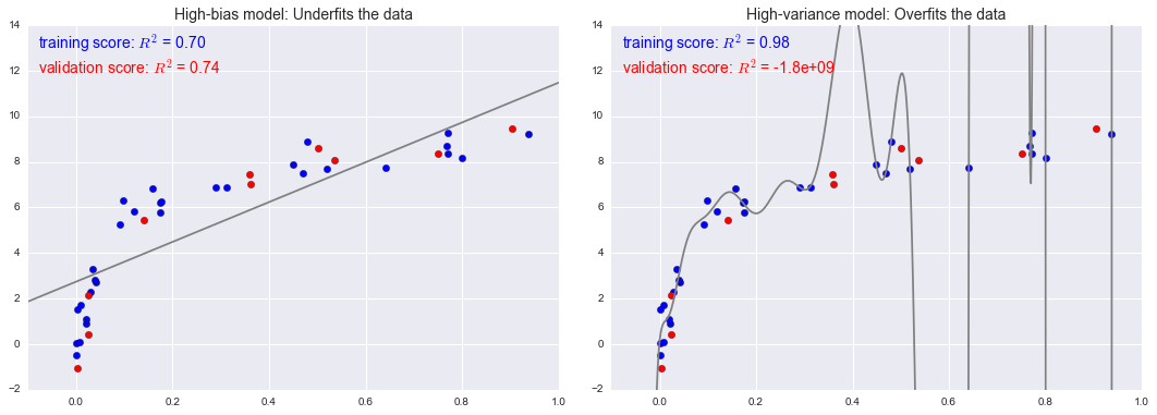
Các chỉ số đánh đổi Sự thiên lệch-Biến thiên
fig, ax = plt.subplots(1, 2, figsize=(16, 6))fig.subplots_adjust(left=0.0625, right=0.95, wspace=0.1)X2, y2 = make_data(10, rseed=42)ax[0].scatter(X.ravel(), y, s=40, c='blue')ax[0].plot(xfit.ravel(), model1.predict(xfit), color='gray')ax[0].axis([-0.1, 1.0, -2, 14])ax[0].set_title('High-bias model: Underfits the data', size=14)ax[0].scatter(X2.ravel(), y2, s=40, c='red')ax[0].text(0.02, 0.98, "training score: $R^2$ = {0:.2f}".format(model1.score(X, y)), ha='left', va='top', transform=ax[0].transAxes, size=14, color='blue')ax[0].text(0.02, 0.91, "validation score: $R^2$ = {0:.2f}".format(model1.score(X2, y2)), ha='left', va='top', transform=ax[0].transAxes, size=14, color='red')ax[1].scatter(X.ravel(), y, s=40, c='blue')ax[1].plot(xfit.ravel(), model20.predict(xfit), color='gray')ax[1].axis([-0.1, 1.0, -2, 14])ax[1].set_title('High-variance model: Overfits the data', size=14)ax[1].scatter(X2.ravel(), y2, s=40, c='red')ax[1].text(0.02, 0.98, "training score: $R^2$ = {0:.2g}".format(model20.score(X, y)), ha='left', va='top', transform=ax[1].transAxes, size=14, color='blue')ax[1].text(0.02, 0.91, "validation score: $R^2$ = {0:.2g}".format(model20.score(X2, y2)), ha='left', va='top', transform=ax[1].transAxes, size=14, color='red')fig.savefig('figures/05.03-bias-variance-2.png')
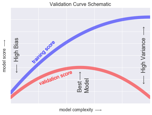
Đường cong xác thực
x = np.linspace(0, 1, 1000)y1 = -(x - 0.5) ** 2y2 = y1 - 0.33 + np.exp(x - 1)fig, ax = plt.subplots()ax.plot(x, y2, lw=10, alpha=0.5, color='blue')ax.plot(x, y1, lw=10, alpha=0.5, color='red')ax.text(0.15, 0.2, "training score", rotation=45, size=16, color='blue')ax.text(0.2, -0.05, "validation score", rotation=20, size=16, color='red')ax.text(0.02, 0.1, r'$\longleftarrow$ High Bias', size=18, rotation=90, va='center')ax.text(0.98, 0.1, r'$\longleftarrow$ High Variance $\longrightarrow$', size=18, rotation=90, ha='right', va='center')ax.text(0.48, -0.12, 'Best$\\longrightarrow$\nModel', size=18, rotation=90, va='center')ax.set_xlim(0, 1)ax.set_ylim(-0.3, 0.5)ax.set_xlabel(r'model complexity $\longrightarrow$', size=14)ax.set_ylabel(r'model score $\longrightarrow$', size=14)ax.xaxis.set_major_formatter(plt.NullFormatter())ax.yaxis.set_major_formatter(plt.NullFormatter())ax.set_title("Validation Curve Schematic", size=16)fig.savefig('figures/05.03-validation-curve.png')
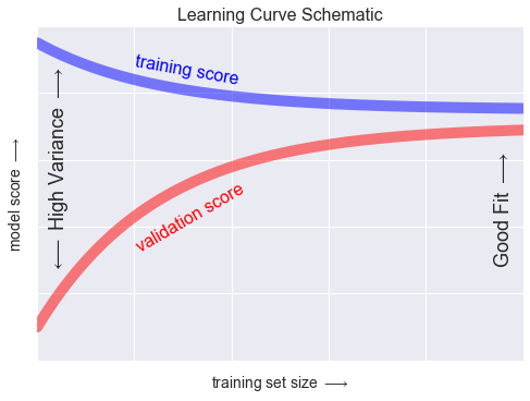
Mức học phí
N = np.linspace(0, 1, 1000)y1 = 0.75 + 0.2 * np.exp(-4 * N)y2 = 0.7 - 0.6 * np.exp(-4 * N)fig, ax = plt.subplots()ax.plot(x, y1, lw=10, alpha=0.5, color='blue')ax.plot(x, y2, lw=10, alpha=0.5, color='red')ax.text(0.2, 0.88, "training score", rotation=-10, size=16, color='blue')ax.text(0.2, 0.5, "validation score", rotation=30, size=16, color='red')ax.text(0.98, 0.45, r'Good Fit $\longrightarrow$', size=18, rotation=90, ha='right', va='center')ax.text(0.02, 0.57, r'$\longleftarrow$ High Variance $\longrightarrow$', size=18, rotation=90, va='center')ax.set_xlim(0, 1)ax.set_ylim(0, 1)ax.set_xlabel(r'training set size $\longrightarrow$', size=14)ax.set_ylabel(r'model score $\longrightarrow$', size=14)ax.xaxis.set_major_formatter(plt.NullFormatter())ax.yaxis.set_major_formatter(plt.NullFormatter())ax.set_title("Learning Curve Schematic", size=16)fig.savefig('figures/05.03-learning-curve.png')
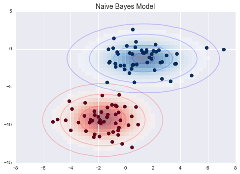
Gaussian Naive Bayes
Ví dụ Gaussian Naive Bayes
from sklearn.datasets import make_blobsX, y = make_blobs(100, 2, centers=2, random_state=2, cluster_std=1.5)fig, ax = plt.subplots()ax.scatter(X[:, 0], X[:, 1], c=y, s=50, cmap='RdBu')ax.set_title('Naive Bayes Model', size=14)xlim = (-8, 8)ylim = (-15, 5)xg = np.linspace(xlim[0], xlim[1], 60)yg = np.linspace(ylim[0], ylim[1], 40)xx, yy = np.meshgrid(xg, yg)Xgrid = np.vstack([xx.ravel(), yy.ravel()]).Tfor label, color in enumerate(['red', 'blue']): mask = (y == label) mu, std = X[mask].mean(0), X[mask].std(0) P = np.exp(-0.5 * (Xgrid - mu) ** 2 / std ** 2).prod(1) Pm = np.ma.masked_array(P, P < 0.03) ax.pcolorfast(xg, yg, Pm.reshape(xx.shape), alpha=0.5, cmap=color.title() + 's') ax.contour(xx, yy, P.reshape(xx.shape), levels=[0.01, 0.1, 0.5, 0.9], colors=color, alpha=0.2) ax.set(xlim=xlim, ylim=ylim)fig.savefig('figures/05.05-gaussian-NB.png')
Hồi quy Tuyến tính
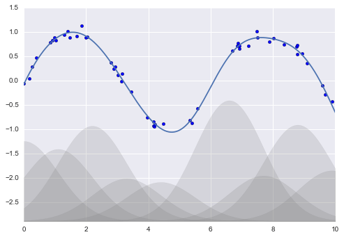
Hàm cơ sở Gauss
from sklearn.pipeline import make_pipelinefrom sklearn.linear_model import LinearRegressionfrom sklearn.base import BaseEstimator, TransformerMixinclass GaussianFeatures(BaseEstimator, TransformerMixin): """Uniformly-spaced Gaussian Features for 1D input""" def __init__(self, N, width_factor=2.0): self.N = N self.width_factor = width_factor @staticmethod def _gauss_basis(x, y, width, axis=None): arg = (x - y) / width return np.exp(-0.5 * np.sum(arg ** 2, axis)) def fit(self, X, y=None): # create N centers spread along the data range self.centers_ = np.linspace(X.min(), X.max(), self.N) self.width_ = self.width_factor * (self.centers_[1] - self.centers_[0]) return self def transform(self, X): return self._gauss_basis(X[:, :, np.newaxis], self.centers_, self.width_, axis=1)rng = np.random.RandomState(1)x = 10 * rng.rand(50)y = np.sin(x) + 0.1 * rng.randn(50)xfit = np.linspace(0, 10, 1000)gauss_model = make_pipeline(GaussianFeatures(10, 1.0), LinearRegression())gauss_model.fit(x[:, np.newaxis], y)yfit = gauss_model.predict(xfit[:, np.newaxis])gf = gauss_model.named_steps['gaussianfeatures']lm = gauss_model.named_steps['linearregression']fig, ax = plt.subplots()for i in range(10): selector = np.zeros(10) selector[i] = 1 Xfit = gf.transform(xfit[:, None]) * selector yfit = lm.predict(Xfit) ax.fill_between(xfit, yfit.min(), yfit, color='gray', alpha=0.2)ax.scatter(x, y)ax.plot(xfit, gauss_model.predict(xfit[:, np.newaxis]))ax.set_xlim(0, 10)ax.set_ylim(yfit.min(), 1.5)fig.savefig('figures/05.06-gaussian-basis.png')
Random Forests
Mã hỗ trợ
Việc sau sẽ tạo ra một module helpers_05_08.py chứa một số công cụ được sử dụng trong In-Depth: Decision Trees và Random Forests.
%%file helpers_05_08.pyimport numpy as npimport matplotlib.pyplot as pltfrom sklearn.tree import DecisionTreeClassifierfrom ipywidgets import interactdef visualize_tree(estimator, X, y, boundaries=True, xlim=None, ylim=None, ax=None): ax = ax or plt.gca() # Plot the training points ax.scatter(X[:, 0], X[:, 1], c=y, s=30, cmap='viridis', clim=(y.min(), y.max()), zorder=3) ax.axis('tight') ax.axis('off') if xlim is None: xlim = ax.get_xlim() if ylim is None: ylim = ax.get_ylim() # fit the estimator estimator.fit(X, y) xx, yy = np.meshgrid(np.linspace(*xlim, num=200), np.linspace(*ylim, num=200)) Z = estimator.predict(np.c_[xx.ravel(), yy.ravel()]) # Put the result into a color plot n_classes = len(np.unique(y)) Z = Z.reshape(xx.shape) contours = ax.contourf(xx, yy, Z, alpha=0.3, levels=np.arange(n_classes + 1) - 0.5, cmap='viridis', clim=(y.min(), y.max()), zorder=1) ax.set(xlim=xlim, ylim=ylim) # Plot the decision boundaries def plot_boundaries(i, xlim, ylim): if i >= 0: tree = estimator.tree_ if tree.feature[i] == 0: ax.plot([tree.threshold[i], tree.threshold[i]], ylim, '-k', zorder=2) plot_boundaries(tree.children_left[i], [xlim[0], tree.threshold[i]], ylim) plot_boundaries(tree.children_right[i], [tree.threshold[i], xlim[1]], ylim) elif tree.feature[i] == 1: ax.plot(xlim, [tree.threshold[i], tree.threshold[i]], '-k', zorder=2) plot_boundaries(tree.children_left[i], xlim, [ylim[0], tree.threshold[i]]) plot_boundaries(tree.children_right[i], xlim, [tree.threshold[i], ylim[1]]) if boundaries: plot_boundaries(0, xlim, ylim)def plot_tree_interactive(X, y): def interactive_tree(depth=5): clf = DecisionTreeClassifier(max_depth=depth, random_state=0) visualize_tree(clf, X, y) return interact(interactive_tree, depth=[1, 5])def randomized_tree_interactive(X, y): N = int(0.75 * X.shape[0]) xlim = (X[:, 0].min(), X[:, 0].max()) ylim = (X[:, 1].min(), X[:, 1].max()) def fit_randomized_tree(random_state=0): clf = DecisionTreeClassifier(max_depth=15) i = np.arange(len(y)) rng = np.random.RandomState(random_state) rng.shuffle(i) visualize_tree(clf, X[i[:N]], y[i[:N]], boundaries=False, xlim=xlim, ylim=ylim) interact(fit_randomized_tree, random_state=[0, 100]);
Overwriting helpers_05_08.py
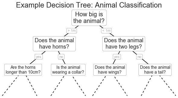
Ví dụ cây quyết định
fig = plt.figure(figsize=(10, 4))ax = fig.add_axes([0, 0, 0.8, 1], frameon=False, xticks=[], yticks=[])ax.set_title('Example Decision Tree: Animal Classification', size=24)def text(ax, x, y, t, size=20, **kwargs): ax.text(x, y, t, ha='center', va='center', size=size, bbox=dict(boxstyle='round', ec='k', fc='w'), **kwargs)text(ax, 0.5, 0.9, "How big is\nthe animal?", 20)text(ax, 0.3, 0.6, "Does the animal\nhave horns?", 18)text(ax, 0.7, 0.6, "Does the animal\nhave two legs?", 18)text(ax, 0.12, 0.3, "Are the horns\nlonger than 10cm?", 14)text(ax, 0.38, 0.3, "Is the animal\nwearing a collar?", 14)text(ax, 0.62, 0.3, "Does the animal\nhave wings?", 14)text(ax, 0.88, 0.3, "Does the animal\nhave a tail?", 14)text(ax, 0.4, 0.75, "> 1m", 12, alpha=0.4)text(ax, 0.6, 0.75, "< 1m", 12, alpha=0.4)text(ax, 0.21, 0.45, "yes", 12, alpha=0.4)text(ax, 0.34, 0.45, "no", 12, alpha=0.4)text(ax, 0.66, 0.45, "yes", 12, alpha=0.4)text(ax, 0.79, 0.45, "no", 12, alpha=0.4)ax.plot([0.3, 0.5, 0.7], [0.6, 0.9, 0.6], '-k')ax.plot([0.12, 0.3, 0.38], [0.3, 0.6, 0.3], '-k')ax.plot([0.62, 0.7, 0.88], [0.3, 0.6, 0.3], '-k')ax.plot([0.0, 0.12, 0.20], [0.0, 0.3, 0.0], '--k')ax.plot([0.28, 0.38, 0.48], [0.0, 0.3, 0.0], '--k')ax.plot([0.52, 0.62, 0.72], [0.0, 0.3, 0.0], '--k')ax.plot([0.8, 0.88, 1.0], [0.0, 0.3, 0.0], '--k')ax.axis([0, 1, 0, 1])fig.savefig('figures/05.08-decision-tree.png')
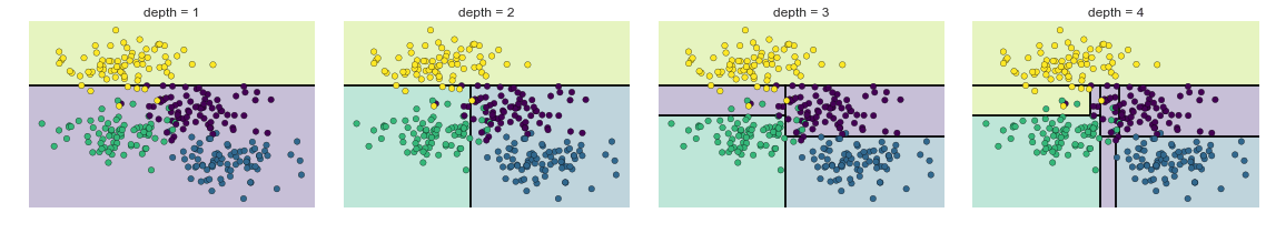
Các Cấp Đậm Quyết Định
from helpers_05_08 import visualize_treefrom sklearn.tree import DecisionTreeClassifierfrom sklearn.datasets import make_blobs fig, ax = plt.subplots(1, 4, figsize=(16, 3))fig.subplots_adjust(left=0.02, right=0.98, wspace=0.1)X, y = make_blobs(n_samples=300, centers=4, random_state=0, cluster_std=1.0)for axi, depth in zip(ax, range(1, 5)): model = DecisionTreeClassifier(max_depth=depth) visualize_tree(model, X, y, ax=axi) axi.set_title('depth = {0}'.format(depth))fig.savefig('figures/05.08-decision-tree-levels.png')
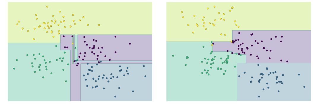
(Quá tải trong cây quyết định)
model = DecisionTreeClassifier()fig, ax = plt.subplots(1, 2, figsize=(16, 6))fig.subplots_adjust(left=0.0625, right=0.95, wspace=0.1)visualize_tree(model, X[::2], y[::2], boundaries=False, ax=ax[0])visualize_tree(model, X[1::2], y[1::2], boundaries=False, ax=ax[1])fig.savefig('figures/05.08-decision-tree-overfitting.png')
Phân tích thành phần chính
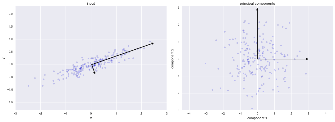
Quá trình Xoay thành phần chính
from sklearn.decomposition import PCA
def draw_vector(v0, v1, ax=None): ax = ax or plt.gca() arrowprops=dict(arrowstyle='->', linewidth=2, shrinkA=0, shrinkB=0) ax.annotate('', v1, v0, arrowprops=arrowprops)
rng = np.random.RandomState(1)X = np.dot(rng.rand(2, 2), rng.randn(2, 200)).Tpca = PCA(n_components=2, whiten=True)pca.fit(X)fig, ax = plt.subplots(1, 2, figsize=(16, 6))fig.subplots_adjust(left=0.0625, right=0.95, wspace=0.1)# plot dataax[0].scatter(X[:, 0], X[:, 1], alpha=0.2)for length, vector in zip(pca.explained_variance_, pca.components_): v = vector * 3 * np.sqrt(length) draw_vector(pca.mean_, pca.mean_ + v, ax=ax[0])ax[0].axis('equal');ax[0].set(xlabel='x', ylabel='y', title='input')# plot principal componentsX_pca = pca.transform(X)ax[1].scatter(X_pca[:, 0], X_pca[:, 1], alpha=0.2)draw_vector([0, 0], [0, 3], ax=ax[1])draw_vector([0, 0], [3, 0], ax=ax[1])ax[1].axis('equal')ax[1].set(xlabel='component 1', ylabel='component 2', title='principal components', xlim=(-5, 5), ylim=(-3, 3.1))fig.savefig('figures/05.09-PCA-rotation.png')
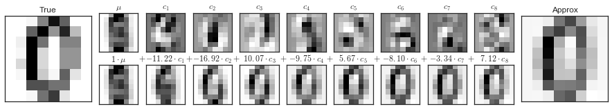
Các thành phần Pixel trong Digits
def plot_pca_components(x, coefficients=None, mean=0, components=None, imshape=(8, 8), n_components=8, fontsize=12, show_mean=True): if coefficients is None: coefficients = x if components is None: components = np.eye(len(coefficients), len(x)) mean = np.zeros_like(x) + mean fig = plt.figure(figsize=(1.2 * (5 + n_components), 1.2 * 2)) g = plt.GridSpec(2, 4 + bool(show_mean) + n_components, hspace=0.3) def show(i, j, x, title=None): ax = fig.add_subplot(g[i, j], xticks=[], yticks=[]) ax.imshow(x.reshape(imshape), interpolation='nearest') if title: ax.set_title(title, fontsize=fontsize) show(slice(2), slice(2), x, "True") approx = mean.copy() counter = 2 if show_mean: show(0, 2, np.zeros_like(x) + mean, r'$\mu$') show(1, 2, approx, r'$1 \cdot \mu$') counter += 1 for i in range(n_components): approx = approx + coefficients[i] * components[i] show(0, i + counter, components[i], r'$c_{0}$'.format(i + 1)) show(1, i + counter, approx, r"${0:.2f} \cdot c_{1}$".format(coefficients[i], i + 1)) if show_mean or i > 0: plt.gca().text(0, 1.05, '$+$', ha='right', va='bottom', transform=plt.gca().transAxes, fontsize=fontsize) show(slice(2), slice(-2, None), approx, "Approx") return fig
from sklearn.datasets import load_digitsdigits = load_digits()sns.set_style('white')fig = plot_pca_components(digits.data[10], show_mean=False)fig.savefig('figures/05.09-digits-pixel-components.png')
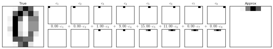
Các thành phần PCA trong Digits
pca = PCA(n_components=8)Xproj = pca.fit_transform(digits.data)sns.set_style('white')fig = plot_pca_components(digits.data[10], Xproj[10], pca.mean_, pca.components_)fig.savefig('figures/05.09-digits-pca-components.png')
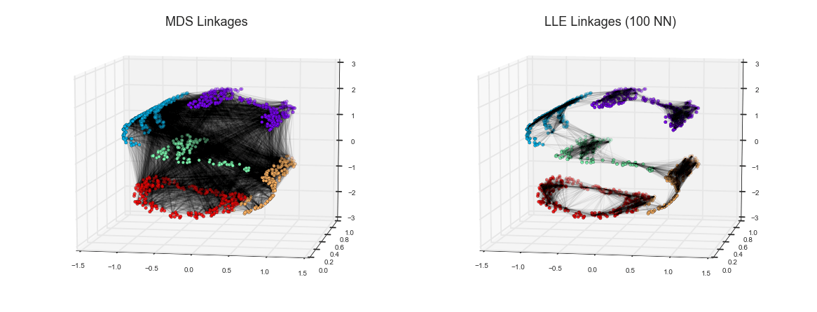
Manifold Learning
LLE vs MDS Linkages
def make_hello(N=1000, rseed=42): # Make a plot with "HELLO" text; save as png fig, ax = plt.subplots(figsize=(4, 1)) fig.subplots_adjust(left=0, right=1, bottom=0, top=1) ax.axis('off') ax.text(0.5, 0.4, 'HELLO', va='center', ha='center', weight='bold', size=85) fig.savefig('hello.png') plt.close(fig) # Open this PNG and draw random points from it from matplotlib.image import imread data = imread('hello.png')[::-1, :, 0].T rng = np.random.RandomState(rseed) X = rng.rand(4 * N, 2) i, j = (X * data.shape).astype(int).T mask = (data[i, j] < 1) X = X[mask] X[:, 0] *= (data.shape[0] / data.shape[1]) X = X[:N] return X[np.argsort(X[:, 0])]
def make_hello_s_curve(X): t = (X[:, 0] - 2) * 0.75 * np.pi x = np.sin(t) y = X[:, 1] z = np.sign(t) * (np.cos(t) - 1) return np.vstack((x, y, z)).TX = make_hello(1000)XS = make_hello_s_curve(X)colorize = dict(c=X[:, 0], cmap=plt.cm.get_cmap('rainbow', 5))
from mpl_toolkits.mplot3d.art3d import Line3DCollectionfrom sklearn.neighbors import NearestNeighbors# construct lines for MDSrng = np.random.RandomState(42)ind = rng.permutation(len(X))lines_MDS = [(XS[i], XS[j]) for i in ind[:100] for j in ind[100:200]]# construct lines for LLEnbrs = NearestNeighbors(n_neighbors=100).fit(XS).kneighbors(XS[ind[:100]])[1]lines_LLE = [(XS[ind[i]], XS[j]) for i in range(100) for j in nbrs[i]]titles = ['MDS Linkages', 'LLE Linkages (100 NN)']# plot the resultsfig, ax = plt.subplots(1, 2, figsize=(16, 6), subplot_kw=dict(projection='3d', axisbg='none'))fig.subplots_adjust(left=0, right=1, bottom=0, top=1, hspace=0, wspace=0)for axi, title, lines in zip(ax, titles, [lines_MDS, lines_LLE]): axi.scatter3D(XS[:, 0], XS[:, 1], XS[:, 2], **colorize); axi.add_collection(Line3DCollection(lines, lw=1, color='black', alpha=0.05)) axi.view_init(elev=10, azim=-80) axi.set_title(title, size=18)fig.savefig('figures/05.10-LLE-vs-MDS.png')
K-Means
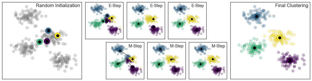
Expectation-Maximization
Trong hình bên dưới là một hình ảnh biểu thị mô phỏng của phương pháp Expectation-Maximization trong phân cụm K Means:
from sklearn.datasets.samples_generator import make_blobsfrom sklearn.metrics import pairwise_distances_argminX, y_true = make_blobs(n_samples=300, centers=4, cluster_std=0.60, random_state=0)rng = np.random.RandomState(42)centers = [0, 4] + rng.randn(4, 2)def draw_points(ax, c, factor=1): ax.scatter(X[:, 0], X[:, 1], c=c, cmap='viridis', s=50 * factor, alpha=0.3) def draw_centers(ax, centers, factor=1, alpha=1.0): ax.scatter(centers[:, 0], centers[:, 1], c=np.arange(4), cmap='viridis', s=200 * factor, alpha=alpha) ax.scatter(centers[:, 0], centers[:, 1], c='black', s=50 * factor, alpha=alpha)def make_ax(fig, gs): ax = fig.add_subplot(gs) ax.xaxis.set_major_formatter(plt.NullFormatter()) ax.yaxis.set_major_formatter(plt.NullFormatter()) return axfig = plt.figure(figsize=(15, 4))gs = plt.GridSpec(4, 15, left=0.02, right=0.98, bottom=0.05, top=0.95, wspace=0.2, hspace=0.2)ax0 = make_ax(fig, gs[:4, :4])ax0.text(0.98, 0.98, "Random Initialization", transform=ax0.transAxes, ha='right', va='top', size=16)draw_points(ax0, 'gray', factor=2)draw_centers(ax0, centers, factor=2)for i in range(3): ax1 = make_ax(fig, gs[:2, 4 + 2 * i:6 + 2 * i]) ax2 = make_ax(fig, gs[2:, 5 + 2 * i:7 + 2 * i]) # E-step y_pred = pairwise_distances_argmin(X, centers) draw_points(ax1, y_pred) draw_centers(ax1, centers) # M-step new_centers = np.array([X[y_pred == i].mean(0) for i in range(4)]) draw_points(ax2, y_pred) draw_centers(ax2, centers, alpha=0.3) draw_centers(ax2, new_centers) for i in range(4): ax2.annotate('', new_centers[i], centers[i], arrowprops=dict(arrowstyle='->', linewidth=1)) # Finish iteration centers = new_centers ax1.text(0.95, 0.95, "E-Step", transform=ax1.transAxes, ha='right', va='top', size=14) ax2.text(0.95, 0.95, "M-Step", transform=ax2.transAxes, ha='right', va='top', size=14)# Final E-step y_pred = pairwise_distances_argmin(X, centers)axf = make_ax(fig, gs[:4, -4:])draw_points(axf, y_pred, factor=2)draw_centers(axf, centers, factor=2)axf.text(0.98, 0.98, "Final Clustering", transform=axf.transAxes, ha='right', va='top', size=16)fig.savefig('figures/05.11-expectation-maximization.png')
K-Means tương tác
Câu chuyện sau đây sử dụng các “interactive widgets” của IPython để trình bày thuật toán K-means một cách tương tác.Chạy mã này trong IPython notebook để khám phá thuật toán expectation maximization để tính toán K Means.
%matplotlib inlineimport matplotlib.pyplot as pltimport seaborn; seaborn.set() # for plot stylingimport numpy as npfrom ipywidgets import interactfrom sklearn.metrics import pairwise_distances_argminfrom sklearn.datasets.samples_generator import make_blobsdef plot_kmeans_interactive(min_clusters=1, max_clusters=6): X, y = make_blobs(n_samples=300, centers=4, random_state=0, cluster_std=0.60) def plot_points(X, labels, n_clusters): plt.scatter(X[:, 0], X[:, 1], c=labels, s=50, cmap='viridis', vmin=0, vmax=n_clusters - 1); def plot_centers(centers): plt.scatter(centers[:, 0], centers[:, 1], marker='o', c=np.arange(centers.shape[0]), s=200, cmap='viridis') plt.scatter(centers[:, 0], centers[:, 1], marker='o', c='black', s=50) def _kmeans_step(frame=0, n_clusters=4): rng = np.random.RandomState(2) labels = np.zeros(X.shape[0]) centers = rng.randn(n_clusters, 2) nsteps = frame // 3 for i in range(nsteps + 1): old_centers = centers if i < nsteps or frame % 3 > 0: labels = pairwise_distances_argmin(X, centers) if i < nsteps or frame % 3 > 1: centers = np.array([X[labels == j].mean(0) for j in range(n_clusters)]) nans = np.isnan(centers) centers[nans] = old_centers[nans] # plot the data and cluster centers plot_points(X, labels, n_clusters) plot_centers(old_centers) # plot new centers if third frame if frame % 3 == 2: for i in range(n_clusters): plt.annotate('', centers[i], old_centers[i], arrowprops=dict(arrowstyle='->', linewidth=1)) plot_centers(centers) plt.xlim(-4, 4) plt.ylim(-2, 10) if frame % 3 == 1: plt.text(3.8, 9.5, "1. Reassign points to nearest centroid", ha='right', va='top', size=14) elif frame % 3 == 2: plt.text(3.8, 9.5, "2. Update centroids to cluster means", ha='right', va='top', size=14) return interact(_kmeans_step, frame=[0, 50], n_clusters=[min_clusters, max_clusters])plot_kmeans_interactive();
Mô hình hỗn hợp Gaussian
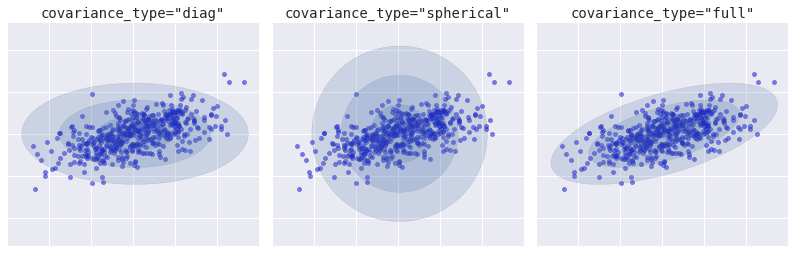
Loại Covariance
from sklearn.mixture import GMM
from matplotlib.patches import Ellipsedef
draw_ellipse(position, covariance, ax=None, **kwargs):
    """Draw an ellipse with a given position and covariance"""
    ax = ax or plt.gca()        # Convert covariance to principal axes
    if covariance.shape == (2, 2):
        U, s, Vt = np.linalg.svd(covariance)
        angle = np.degrees(np.arctan2(U[1, 0], U[0, 0]))
        width, height = 2 * np.sqrt(s)
    else:
        angle = 0
        width, height = 2 * np.sqrt(covariance)
        # Draw the Ellipse
    for nsig in range(1, 4):
        ax.add_patch(Ellipse(position, nsig * width, nsig * height,                             angle, **kwargs))
fig, ax = plt.subplots(1, 3, figsize=(14, 4), sharex=True, sharey=True)
fig.subplots_adjust(wspace=0.05)
rng = np.random.RandomState(5)
X = np.dot(rng.randn(500, 2), rng.randn(2, 2))
for i, cov_type in enumerate(['diag', 'spherical', 'full']):
    model = GMM(1, covariance_type=cov_type).fit(X)
    ax[i].axis('equal')
    ax[i].scatter(X[:, 0], X[:, 1], alpha=0.5)
    ax[i].set_xlim(-3, 3)
    ax[i].set_title('covariance_type="{0}"'.format(cov_type),                    size=14, family='monospace')
    draw_ellipse(model.means_[0], model.covars_[0], ax[i], alpha=0.2)    ax[i].xaxis.set_major_formatter(plt.NullFormatter())    ax[i].yaxis.set_major_formatter(plt.NullFormatter())
fig.savefig('figures/05.12-covariance-type.png')